How to Choose Floral Print Silk Fabric in 2026?
Choosing Floral Print Silk Fabric in 2026 requires more than matching colors to a trend board. Silk responds visibly to light, humidity, friction, and finishing treatments. A deep peony print may look luxurious online, yet appear dull under showroom lighting. Touch the fabric, bend it, and inspect the reverse side.
Industry data supports careful selection. Grand View Research identifies continued growth in the global silk market, driven partly by premium apparel and luxury home textiles. However, silk remains a smaller fiber category than polyester and cotton. Textile Exchange’s Materials Market Report 2024 also emphasizes material traceability, responsible sourcing, and clearer environmental information. These findings matter when comparing silk origin, dyeing methods, and supplier claims.
A reliable evaluation should examine fiber composition, momme weight, weave, print clarity, colorfastness, and finishing quality. Mulberry silk usually offers a smoother hand, while noil or wild silk can provide a textured, less uniform surface. Neither is automatically better. It depends on the garment, season, and expected wear.
Check the supplier’s test records.
Ask for a physical swatch.
For sensitive skin or luxury production, OEKO-TEX certification can provide useful chemical-safety assurance, although certification does not prove every sustainability claim. Care labels should align with ISO 3758 guidance and the fabric’s actual behavior. I have found that small inconsistencies often reveal more than polished product photography. A slightly uneven flower edge may reflect printing limitations, not poor quality. Still, it deserves investigation before purchase.
This guide explains how to compare Floral Print Silk Fabric with greater confidence, practical detail, and realistic expectations in 2026.
Define the Main Types of Floral Print Silk Fabric
How to Choose Floral Print Silk Fabric in 2026?
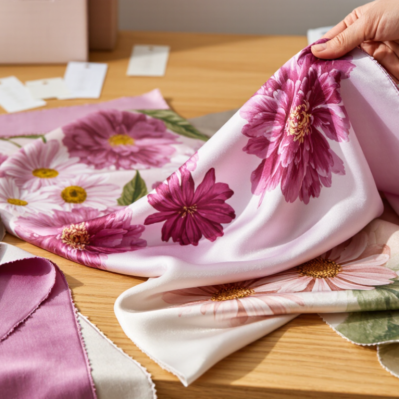
Floral print silk fabric comes in several main types, and each creates a different visual effect. Silk satin has a smooth, glossy surface that makes large flowers look vivid. It suits evening dresses, scarves, and decorative blouses. Silk twill feels firmer and shows a subtle diagonal texture. Its structure supports detailed floral patterns without looking too flat.
Chiffon and georgette are lighter choices. Chiffon feels airy and slightly transparent, so layered petals can create gentle depth. Georgette has more grain and movement, which helps small flowers look relaxed rather than overly delicate. Silk crepe offers a dry, softly textured surface. It reduces shine and works well for daily dresses or loose shirts. Habotai, also called plain-weave silk, feels light and smooth. It accepts color clearly, but it may crease more easily.
Look closely before buying. Rub a hidden edge gently between your fingers. Quality silk should feel smooth, not waxy or excessively slippery. Hold the fabric near a window and check whether the print remains sharp on both sides. Uneven color can suggest poor printing or intentional hand-dye variation, so ask for production details. I once preferred a brighter satin, but its stiff drape made the flowers look crowded. That choice needed more thought. No type is perfect. Consider weight, transparency, drape, print scale, and care requirements together. A small sample reveals more than a digital image.
Match Floral Scale and Color to Your Garment Design
How to Choose Floral Print Silk Fabric in 2026?
Match Floral Scale and Color to Your Garment Design
Floral scale should follow the garment’s visual space. Small flowers suit narrow collars, fitted blouses, and gathered sleeves because they keep details readable. Medium motifs work well on bias-cut dresses and relaxed shirts. Large flowers need uninterrupted panels, such as wide skirts or flowing kaftans. Otherwise, the print may break across seams and look accidental. I have made that mistake before.
Silk reflects light, so colors usually appear richer than they do on paper. For daytime garments, pair a soft ground with two clear floral shades. Ivory with sage and muted coral feels gentle without looking dull. Evening designs can handle deeper grounds, including ink blue or burgundy, with one brighter accent. Keep the background and dominant flower sufficiently different in value. A beautiful print can disappear under indoor lighting.
A 2024 Textile Exchange Materials Market Report estimated global fiber production at 124 million tonnes in 2023, with continued growth projected through 2030.
The figure reinforces a practical point: thoughtful fabric selection matters in a crowded material market. The State of Fashion 2025 report also described fashion growth as modest, making adaptable designs increasingly valuable. Choose a floral silk that supports several styling options, not only one photograph.
Before cutting, request a larger sample and inspect it beside your lining, thread, and skin tone. Small swatches can mislead. I still question whether every dramatic print deserves a full garment.
Evaluate Silk Quality, Weave, Weight, and Print Durability
How to Choose Floral Print Silk Fabric in 2026?
When choosing floral print silk, inspect the fiber before admiring the pattern. Long, continuous filaments usually create a smoother surface and cleaner shine. Hold the fabric near a window. High-quality silk should look luminous, not plastically glossy. Small slubs can be natural, but frequent thick knots may indicate inconsistent production.
Weave controls both movement and durability. Satin feels fluid and reflects light strongly, while twill offers more body and resistance to snagging. Crepe weaves provide a textured, softly matte finish. Check the weight in momme, but do not treat one number as a quality guarantee. A 12-momme silk may suit a blouse, while 16 to 22 momme often feels better for dresses or scarves. I once chose a beautiful lightweight silk that became transparent under indoor lighting. The mistake was obvious later.
Tips: Rub a hidden corner with a white cloth. Then examine color transfer. Ask for a wash-test sample whenever possible. Hand washing, heat, and friction can weaken printed details. Look closely at flower edges. Sharp outlines suggest controlled printing, while blurred areas may reflect poor registration. Still, soft bleeding is sometimes intentional in watercolor-style designs. I find this difficult to judge from photographs alone. Request daylight images and close-ups. Check whether the reverse side shows even color penetration. A durable print should remain attractive after gentle care, not only during the first fitting.
How to Choose Floral Print Silk Fabric in 2026?
Comparison of common silk fabric constructions using practical 1–10 reference scores for silk quality, weave stability, weight suitability, and print durability. Higher scores indicate stronger performance for structured floral garments and repeated care.
Reference basis: fabric weight is typically evaluated in g/m², while weave stability and print durability depend on yarn quality, construction density, dye or pigment fixation, finishing, and washing conditions. Charmeuse and twill generally offer stronger print clarity and wear resistance than very lightweight chiffon, while heavier fabrics provide better opacity and dimensional stability.
Check Fabric Care Needs, Sourcing Standards, and 2026 Trends
How to Choose Floral Print Silk Fabric in 2026?
Floral silk should feel smooth, balanced, and alive under natural light. I inspect a sample near a window, not only under showroom lamps. Check the weave closely. Loose threads may reveal weak finishing. Rub a white cloth gently over the print. Color transfer is a warning sign. Ask for the fiber composition, fabric weight, dyeing method, and recent independent test reports. Reliable suppliers should explain silk origin, wastewater controls, worker safety, and batch traceability. Vague answers deserve caution. A beautiful swatch cannot replace evidence.
Care needs shape the purchase. Choose a washable finish only when the care instructions are clear and tested. For most silk, use cool water, mild detergent, and gentle handling. Never twist wet fabric. Air-dry it away from direct sunlight. Test a small cutting first, because floral dyes can behave unevenly. I once trusted a vivid sample too quickly; the first wash softened the background more than expected. That mistake still informs my inspections.
Tips: Compare at least three swatches. Photograph them in daylight. Request shrinkage and colorfastness results. For 2026, look for painterly garden motifs, smaller scattered flowers, and quieter botanical palettes. Digital printing can create sharper petals with less setup waste, but print quality varies. Ask about ink safety and production controls. Trends change quickly. Care facts last longer.